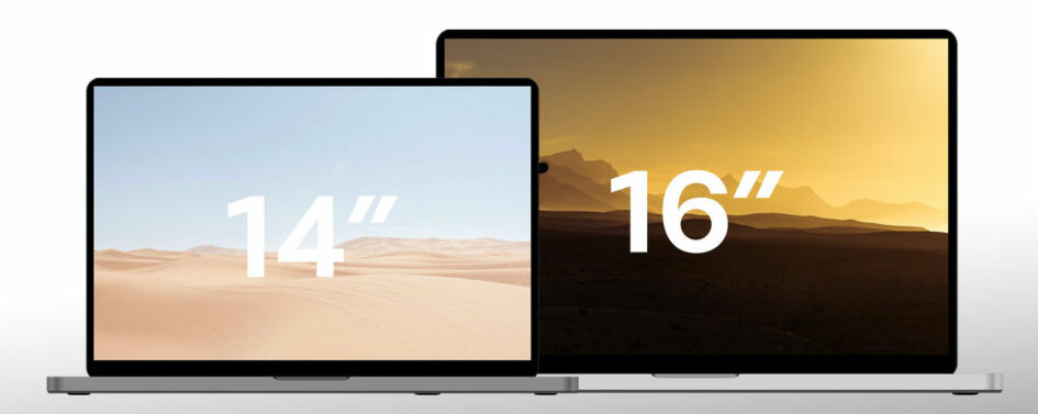
I recently acquired a new 14-inch MacBook Pro with the M1 chip. After a month or so of use, I am happy to say it is an excellent machine and I’m very pleased about taking the plunge. After years of Apple making questionable (even pointless) design decisions, the new MacBook Pro is a breath of fresh air.
For comparison on performance-related items, I’ll share my primary use case. I’m a software developer working on a large NodeJS application. This requires Docker running multiple containers and all the supporting infrastructure for software teams like JIRA, MS Teams and/or Slack. Plus my browser usually has multiple windows and dozens of tabs open, most of them running some sort of web app.
This can be very CPU intensive.
On previous generations of MacBook Pro, firing up the NodeJS application would make the fans sound like a wind tunnel and the laptop would be hot to the touch. The new M1 chip is amazing in this category. I have to lean close to tell if the fans are spinning and the laptop does not approach what I would call hot.
I’m impressed.
The screen is beautiful, colors are vivid and I can choose a variety of resolutions to suit my needs. Like most Apple screens, you would be hard pressed to find something equal or better in quality.
Battery life is excellent too. I was able to put in a full day’s work unplugged. And that’s with a lot of stuff running. My browser with dozens of tabs open (including Outlook and Teams), the previously mentioned NodeJS project with multiple containers, VS Code with a lot of plugins. I would have struggled to get 3 hours on a previous generation MacBook Pro.
Some things that have returned are also nice. The HDMI port and card reader are convenient. The return of MagSafe for power while retaining the ability to charge via thunderbolt is also a welcome change. It might have been nice to add just 1 USB-A port, but I can’t fault Apple for that. It will probably be irrelevant in the near future.
I’m also pleased with some things that have been removed. One of the worst things about recent MacBook Pro generations has been the horrible keyboard and Touch Bar. Thankfully, Apple has ditched both of these atrocities on the new MacBook Pro. Adding a row of full-size function keys and replacing the new keyboard has made a huge difference in usability. I won’t say I like the new keyboard as much as the ThinkPad keyboard, but it’s much improved.
I’ve commented before about how companies are so interested in innovating — or at least appearing to innovate — that they end up creating new things that have no practical value. Like the previously mentioned Touch Bar keyboard.
Unfortunately, the new MacBook Pro introduces a new “innovation” (pain point, in my opinion). It has a notch. In the interest of providing more screen space, the top bezel has been replaced with a notch. One might applaud the efficient use of space, but it introduces some new problems. In an OS where one of the primary design concepts is a top bar that holds menus and icons, items can get lost behind the notch.
To be fair, my company is to blame for the traffic jam in the top bar with the number of unnecessary applications they install. But it’s not just icons the notch can obscure. A number of software titles have a lot of menu items, which can also end up hidden behind the notch.
But the notch represents only a small blemish on an otherwise fantastic machine. It may take the PC world a few years to catch up to the combination of power and efficiency the new MacBook Pro offers.
The screen is excellent, the performance is amazing and the battery life is outstanding. If you’re not married to Windows or Linux, I would highly recommend the new MacBook Pro to anyone who’s in the market for a high-end laptop.

