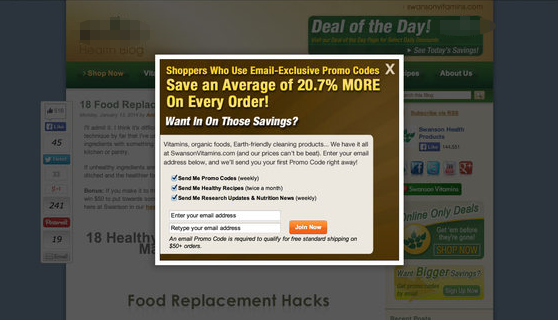
Website owners should be careful when listening to marketing people. Current trends in web marketing are evidence of this. What sounds great on paper in terms of sales, sign-ups and engagement can actually be quite annoying to users. Today I present, for the reader’s annoyance, the modal pop-up window.
Many of us remember the Internet’s youth and the exceptionally annoying pop-up windows that would afflict us as we browsed the web. Some sites would generate dozens of these. We also remember when browsers introduced the ability to block these windows. The resulting jubilation over this convinced most browser makers to block pop-up windows by default.
As the web began to host in-browser applications, new technologies were developed to accommodate them. AJAX allows communication between the browser and the server without a page refresh. Javascript allows for creating what looks like windows without actually opening new browser windows. These are called modal windows.
They have resulted in many things we enjoy like Gmail, Evernote, Office 365 and many others. When used effectively and tastefully, they are able to mimic the experience of native applications and make web-based software feasible.
Unfortunately, the marketing world also discovered this concept and took it to a terrible place – the modal pop-up window. The modal pop-up is a specific type of modal window that pops up to interrupt users as they browse websites. Its most common use is to get in the user’s way to solicit subscriptions to email lists in exchange for coupons.
Apparently, marketers have forgotten that users hated the old browser window pop-ups. Instead, they have found a new way to be the sleazy door-to-door salesman of old. Akin to sticking their foot in the door, they pop up over the content the user is attempting to read with an offer of a token percentage off in exchange for the user’s email address.
Allow me to demonstrate the terrible user experience this presents. After searching for a particular type of product, I click on a result that looks promising. I land on a page that appears to have all the information I’m looking for. But as I start reading it, something terrible happens. Part or all of the content is suddenly covered up with a modal pop-up offering 10% off my first order if I sign up for yet another piece of junk mail (I mean, newsletter).
I’ve got a problem now. I’m trying to read the information about this product to see if it suits my needs, but I can’t because a modal pop-up is in my way. I could sign up and get 10% off, but then I’d be subscribed to more spam and I don’t know if I want the product yet. I could close the window, but then I don’t know if I’ll be offered the same discount later. My reason for visiting the site has been removed. I’ve been side-tracked.
More than that, I’m annoyed. I may decide to continue reading once I’ve closed the modal pop-up, but I may go look at the competition instead. Or I may find another vendor. Instead of being enticed by the 10% discount, I’m annoyed that I was forced to decide before I could read the information. If I do buy the product, I’m likely to get it from another source. After all, I just lost my discount.
Even if I decide to sign up without knowing anything about the product, I would be annoyed to be signed up for yet another piece of spam. Either way, this website has annoyed me. Even if I decide to buy from them and get my discount because I was gullible and signed up, I’ll unsubscribe immediately. Worse yet, I may report the next email as spam, forgetting I signed up for it (or just to spite them).
The bottom line is I’ve had a sub-par experience. If I sign up for the newsletter, marketers will call this engagement and produce numbers to support that claim. If I go on to buy the product in spite of the annoying pop-up, marketers will claim it was because of the pop-up. Unfortunately, many website owners listen to them. Either way, I’ll probably find a different place to shop.
These pop-ups are even worse when I’m researching a topic. When I land on the page containing the information I’m after, I expect to read it. It’s very annoying when a pop-up prevents me from doing so. At that point, the page has just rendered itself useless by providing inaccessible reading material. I’ll most likely click my back button and move on to the next search result.
A word of advice to website owners: numbers do lie, especially statistics. As Mark Twain (and Benjamin Disraeli and others) said, “There are three kinds of lies: lies, damned lies and statistics.” Your marketing department will always produce favorable numbers, not truth. After all, they want to keep their jobs. I’ve encountered very few people who like pop-up windows on websites. Most people I know hate them. Ask around. Hear what real people have to say.
It’s sad that user opinion is not enough to convince many website owners. Thankfully, Google has announced a more compelling reason not to use pop-ups. Google doesn’t like them and will reflect this in their search results, favoring sites without pop-ups. https://webmasters.googleblog.com/2016/08/helping-users-easily-access-content-on.html. Yeah, I like that.


Leave a Reply