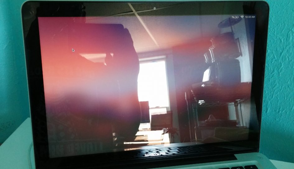
Years ago, I owned a 2008 MacBook Pro. Not the unibody model, the one with the anti-glare screen. I remember how happy I was with that laptop. It had one of the best versions of OS X (Snow Leopard), a nice keyboard and plenty of power. One important specification of mine: no glossy screen.
The importance of that decision was brought to light when my company upgraded me to a new 2012 MacBook Pro. Apple didn’t offer anything other than a glossy screen at that point. So I discovered the annoyance of having to reposition regularly to avoid the shifting light throughout the day. While I appreciated the increase in processing power and RAM, I sorely missed my anti-glare screen.
These days, my personal machine is a ThinkPad x230. No gloss on that screen. It’s so much more versatile when it comes to space. I can sit just about anywhere — even outside — and have no trouble viewing the screen. Try doing that with a MacBook.
I don’t have a problem with glossy screens in general. But I think they are a big mistake on laptops. I know they’re prettier and make colors look better. On a desktop computer, when you control its placement and the light sources in the room, it makes sense. Especially if you’re an artist or graphic designer. But they catch every possible glare and make it difficult to see the screen if the lighting isn’t perfect.
On a laptop, a glossy screen is insane. With mobility as one of the key selling points, having to limit your position and screen angle makes your mobile machine not so mobile. You shouldn’t have to be a contortionist to view your laptop’s screen.
I realize some people like touch screen laptops (another decision I don’t like) but that doesn’t justify the resulting limits to choice of space. The bottom line for me is that a glossy screen makes a mobile computer less mobile, and therefore, less useful.


Leave a Reply