Remember when I asked why Linux was not more popular? One of the reasons is too much choice. Linux is all about freedom and choice. From the kernel to the distribution to the type of user interface, there are lots of options. It’s why some people love it. It’s why others get overwhelmed by the first few choices and can’t give it an honest try.
The choice of desktop environment is no different. The main two, traditionally, have been GNOME and KDE. But you can also choose MATE, XFCE, Budgie, Cinnamon, OpenBox and many others. More often than not, your choice of distribution will give you a default.
One common thread between desktop environments is the underlying graphical toolkit used to draw the elements. The vast majority of desktop environments use either GTK or QT. KDE uses QT. GNOME uses GTK. The majority of desktop environments use GTK.
I’ve spent most of my Linux experience using GTK-based desktop environments. I’ve only tried KDE for brief periods of time (a day up to a week).
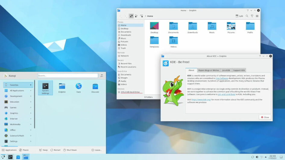
This time, I decided to give KDE a proper go. So I decided to spend a month wtih KDE. This would expose me to all the bits and pieces and really give me an idea what the desktop is like.
I’ve been using it for a month, and in this post I will describe my experience acclimatizing to the KDE ecosystem. For this experiment, I decided to use Kubuntu. Since I was using Ubuntu before, the only differences I will experience will be desktop-related.
Obviously, many things don’t work the same as they do in GNOME, so I spent a fair amount of time researching. How do I show all windows? What’s the best PDF viewer? How do I integrate my browser with the system? How can I make Dolphin (the file manager) behave the way I like?
I won’t keep you in suspense. It’s been a month and I’m ready to go back to the GTK world, and here are my primary reasons:
- Non-QT applications are clunky in KDE. They don’t look quite right and frequently don’t behave correctly. File dialogs don’t display correctly and don’t have the same bookmarks. I use several third party applications that are written in GTK or Electron. They’re simply “not quite right” enough to ruin the experience for me. Which brings me to …
- Most web browsers for Linux are written with GTK in mind. Given that most people use their web browser for 50% or more of their computing experience, this is a major oversight. File dialogs are somewhere between clunky and terrible. And even though this is completely unscientific, Brave and Firefox crashed more on KDE than on GNOME for me. May simply be my experience.
- I can’t find a theme and/or color scheme I’m happy with. Go ahead, make fun of me for this. But I simply can’t get comfortable with the look and feel. Even when only using QT-based apps.
- KDE cannot remember window positions on my 2nd monitor. Only the first/primary. This appears to be a known issue and has been for awhile.
- KDE application developers have a silly tendency to give their software a name that starts with the letter K. Konqueror, Kate, Kontact, etc. To me, it’s as bad as putting “i” or “e” in front of everything. Makes it seem a bit unprofessional.
- I’m not particularly fond of the standard desktop paradigm we’ve been using since Windows 95. I know I can move things around in KDE, but in my experience, the more you deviate from the primary design, the more weirdly things behave. And I’m not a huge fan of the general Windows 10 look.
I think if I could have found a QT-native communication suite I liked (email/calendar/contacts) and a browser that looked and behaved correctly in KDE, I might have stuck with it. Reconfigure the panel, work out more familiar keyboard shortcuts, etc.
It’s a solid system now and doesn’t crash and flake out like it did a few years ago. And it looks nice, especially when only using QT applications. It’s just a small collection of details that didn’t work for me.
I’ve decided to give Budgie a try. The Ubuntu flavor. Again, so that the only real difference is the desktop environment. I’ll report back in a month.

